The Power of Composition and Proportion in Interior Styling
In today’s article, I will share my view on the power of composition and proportion in interior styling. These aren’t just design buzzwords. The well-thought-out composition is the essence of a truly luxurious home. They serve as the foundation and framework for every room, turning the mundane into the magnificent.
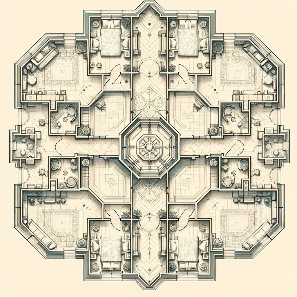
Table of Contents
Understanding the Foundation of Luxury Interior Styling
Attributes of luxury home styling vary, but a rewarding experience often demands a mixed bag of composition and proportion. Impeccable styling effortlessly weaves these two elements together, resulting in beautiful, harmonious living spaces. Indeed, luxury is more than lavishness; it is the curated blend of class, comfort, and sophistication.
Definition of Composition and Proportion
Composition is the delicate art of arranging elements in a visually captivating manner. Proportion, on the other hand, deals with the relative sizes and ratios between these elements. When these principles are married together perfectly, you set the stage for a home that’s not just visually striking but also feels just right.
Principles of Composition
Balance
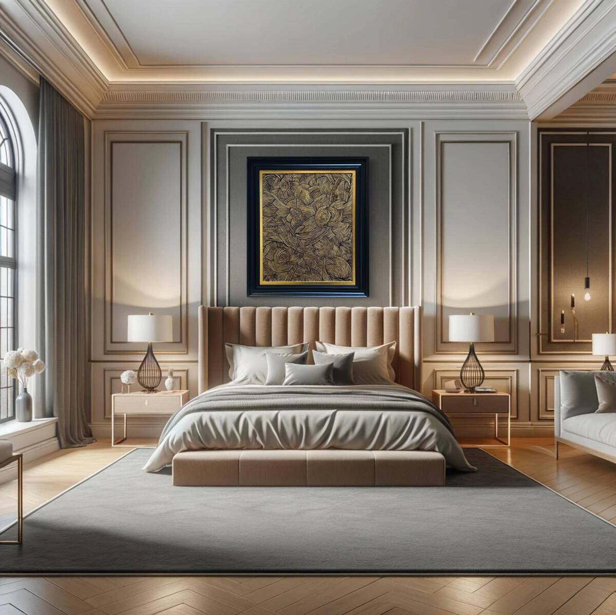
Balance is crucial for cultivating a serene atmosphere. It’s not merely about distributing furniture evenly but also about creating a flow that guides the eye. Whether it’s through symmetrical placement or a well-thought-out color palette, balance is what makes a space inviting.
Rhythm
Much like rhythm in a good song keeps you humming, rhythm in interior design keeps the eyes dancing across the room. Through repeated patterns, color coordination, or varying textures, rhythm adds a layer of sophistication that keeps the design from being monotonous.
Emphasis
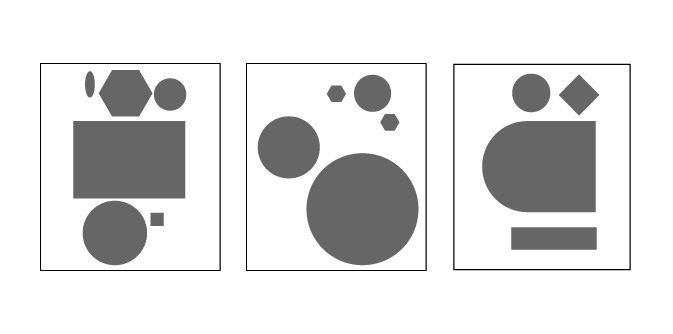
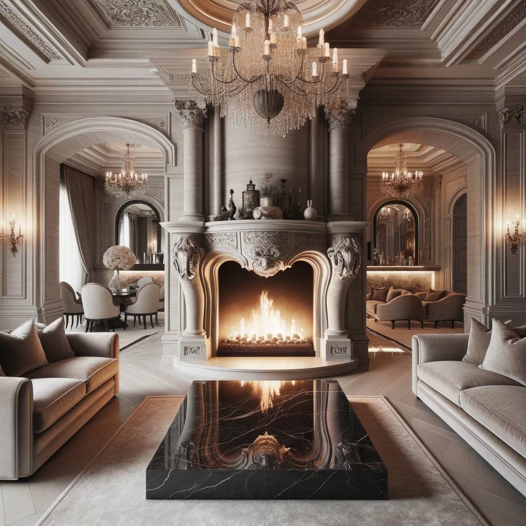
Emphasis is about placing a spotlight on a particular design element that serves as the room’s crown jewel. Whether it’s a striking piece of art or a lavish fireplace, this focal point should be so compelling that it almost commands the surrounding space to organize around it.
Unity
Unity is the end goal of any good design. It ensures that each element, from your floor tiles to your ceiling fixtures, contributes to a harmonious whole. When each piece complements the other, you achieve a sense of unity that is both pleasing to the eye and calming to the spirit.
Consider Composition and Proportion to Achieve Modern Mansion Look
To achieve a modern mansion look requires thoughtful room proportions and layouts. The proportion in interior design is all about the flow of spaces. Considering the golden ratio in interior design creates balance and harmony. With a well-proportioned foundation, the mansion can then be furnished for a cohesive modern style. The key ingredients are scale and proportion in the interior.
Ceiling Height
Ceiling height is more than just a vertical measurement; it’s a mood setter. High ceilings are often found in luxury homes because they evoke a sense of grandeur and space, while a lower ceiling can give off a more intimate, cozy feeling. The ceiling sets the tone for what lies beneath it.
Window and Door Sizes
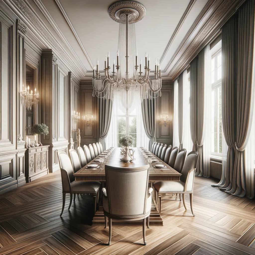
Windows and doors must offer more than function; they need to fit seamlessly into your design. Large, floor-to-ceiling windows are common in luxury homes, offering not just abundant light, but a grandeur that smaller windows simply cannot achieve.
Furniture Scale
The scale of your furniture can either make or break your design. For larger rooms, you’ll want sizeable, substantial furniture that doesn’t get lost in the space. In smaller rooms, more delicately scaled furniture works better, providing comfort without overwhelming the space.
Using Composition and Proportion
Focal Points
Material Choices–Stone
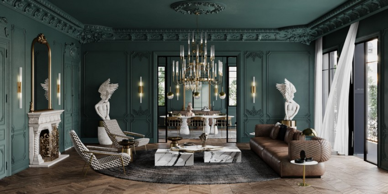
When used as a centerpiece, stone can serve as an anchor, providing a strong focal point that draws attention and admiration. Its combination of natural beauty and refined elegance makes stone a popular choice for those seeking to create a visually stunning and harmonious environment.
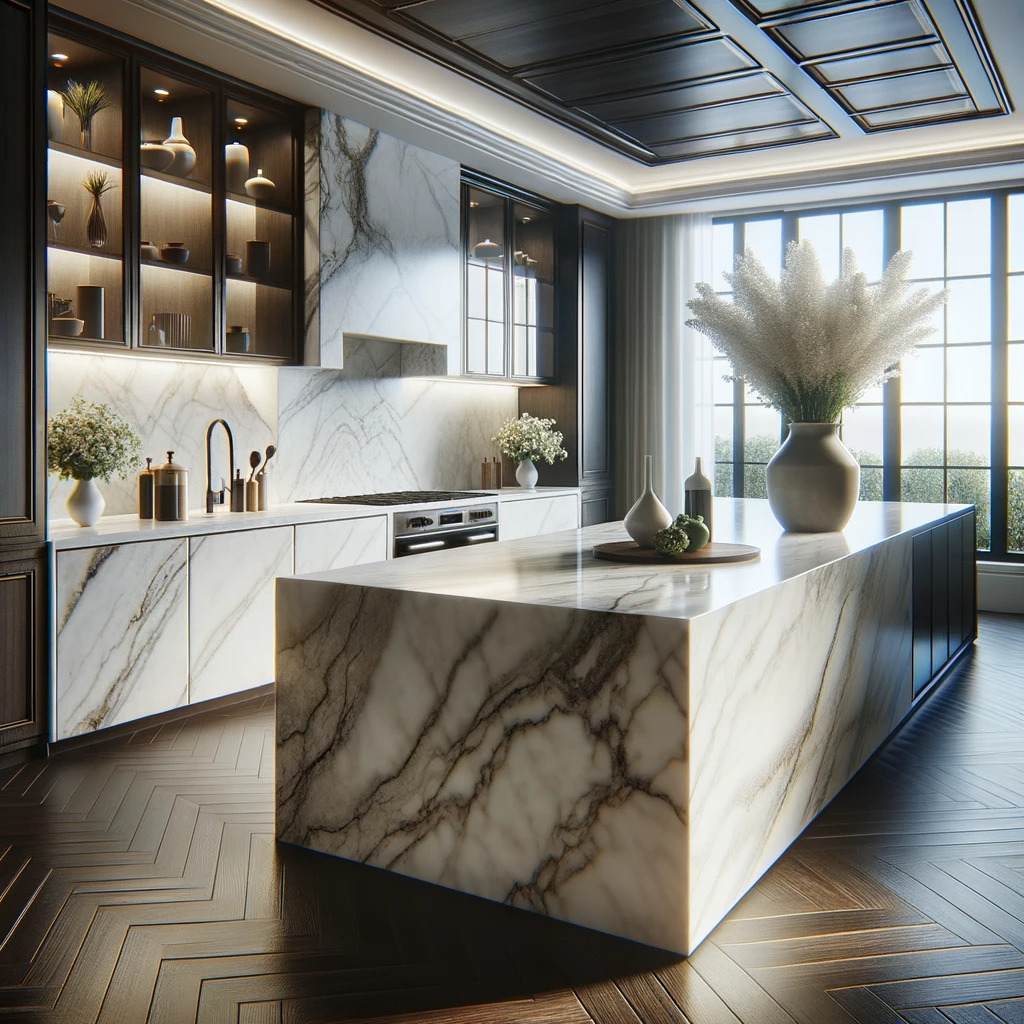
A focal point serves as the anchor of a room. Whether it’s a remarkable painting or an elegant piece of furniture, this is what your eye should naturally gravitate towards. It gives the room a sense of purpose and provides a guideline for arranging additional elements.
Symmetrical balance VS. Asymmetrical balance
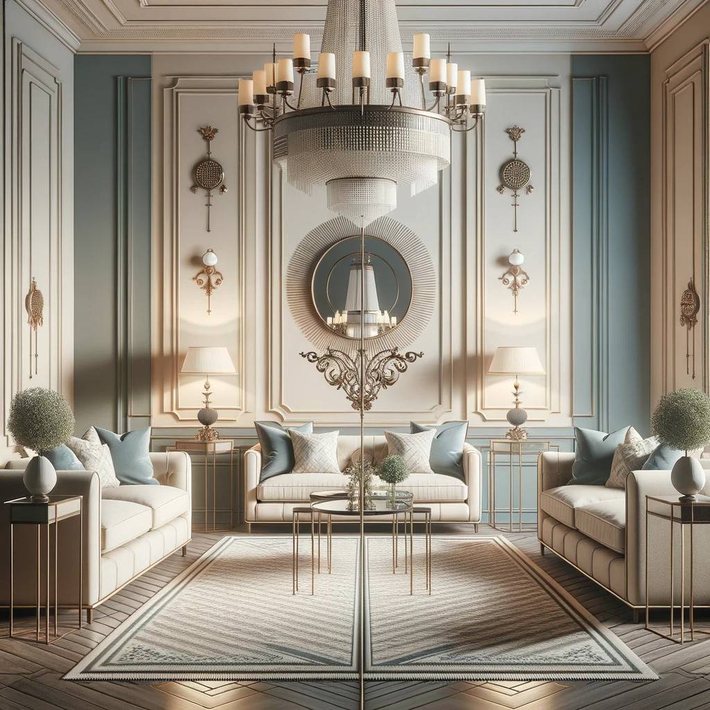
While symmetry offers a classic, orderly look, asymmetry brings excitement and unpredictability into a room. Each has its place: symmetry often brings a sense of peace and formality, while asymmetry can inject energy and modern flair.
Symmetrical balance
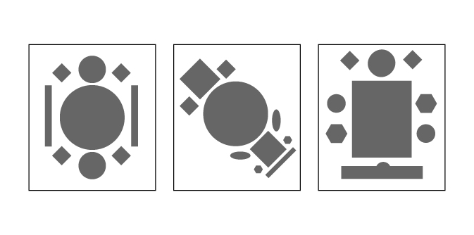
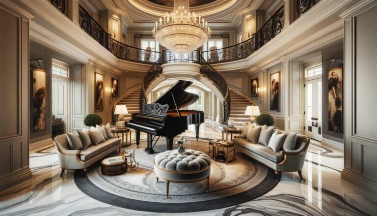
While both aim to create a sense of balance in a space, they go about it in very different ways. Symmetrical balance is all about mirroring elements on either side of a central axis. Think of a grand staircase with identical railings and decor on both sides—it’s pleasing to the eye and brings a sense of formality.
Asymmetrical balance
Asymmetrical balance, on the other hand, uses different elements that have equal visual weight to create balance. Imagine a large piece of artwork on one side of a room balanced by a similarly scaled piece of furniture on the other. It feels dynamic, a bit edgy, and introduces visual interest and movement.
So, whether you’re going for classic elegance or modern flair, the type of balance you choose can significantly impact the room’s vibe.
Negative Space
Negative space is not wasted space; it’s an essential part of the design. It offers breathing room and allows for a cleaner, uncluttered look. A well-planned use of negative space can bring balance and focus to the most complex of designs.
Contrast
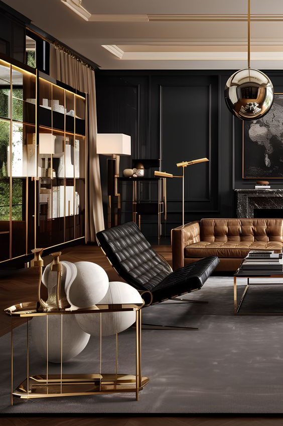
Contrast provides the thrill factor in interior design. A dark-colored wall against a white ceiling, a rugged texture next to a smooth one, the play between contrasts creates visual excitement and adds a dynamic feel to any room.
Exploring Color and Texture in Luxury Home Styling
Every color has a unique feel, and texture imparts character. Both go hand in hand and can significantly influence the ambiance of a luxury home. Implementing a careful color palette and texture choices gives the home a rich, layered appeal.
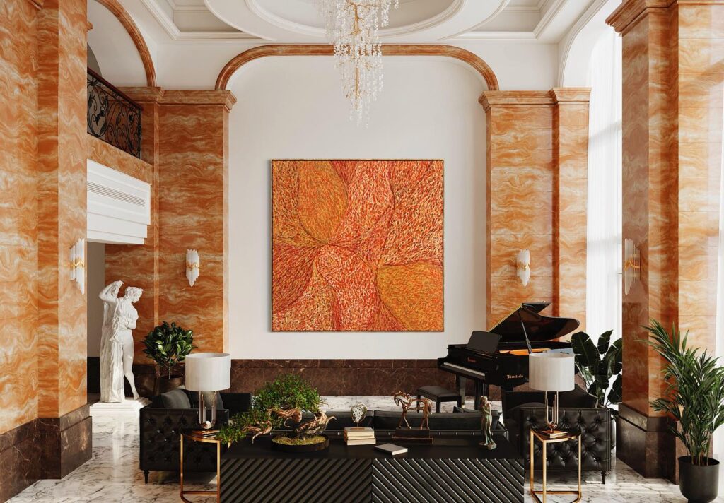
Design Accents–Wall Art
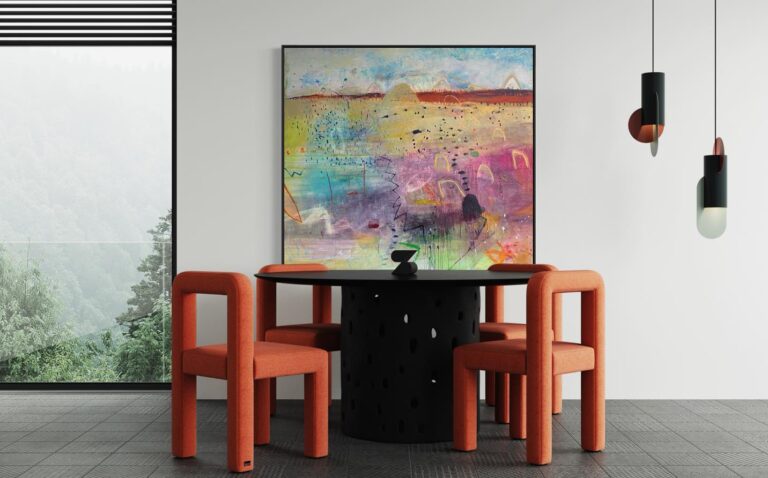
When you want to make a statement, think big or don’t bother. Large artworks have the power to grab attention and transform the look and feel of a space. They become the center of attention and add a touch of elegance to the entire interior design.
Conclusion
While the principles of composition and proportion are foundational, your unique touch is the cherry on top. Keep the guidelines in mind, but never be afraid to sprinkle in your own flair to make the space uniquely yours.


